Healthcare Analytics: Diabetes Prediction
Project by Kathy Tran • View Code on GitHub
Introduction
Diabetes is a prevalent chronic disease, and early detection using routine clinical measures can greatly improve patient outcomes. In this project, I analyze the Pima Indians Diabetes dataset (768 subjects, eight clinical features). First, I perform exploratory data analysis, compute Pearson correlations (e.g., between insulin and glucose), and conduct hypothesis tests (e.g., Welch’s t‑test on blood pressure differences across age groups). Next, I build and evaluate logistic regression models using PCA, retaining 90% of variance, and compare their accuracy and ROC AUC.
# Does higher age indicate higher blood pressure?
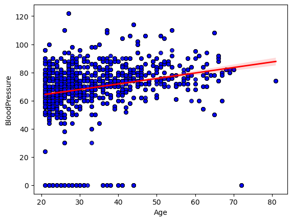
I began by exploring the relationship between age and diastolic blood pressure in our dataset. I created a scatterplot of each subject’s age against their measured blood pressure.
To quantify how strongly age and blood pressure move together, I calculated Pearson’s correlation coefficient. This gave me a single r-value, along with its two‑tailed p‑value, confirming that the observed upward tilt of the points wasn’t due to random chance alone. In my case, the correlation coefficient fell around 0.3, indicating a clear but moderate positive association.
Conclusion: The statistically significant moderate correlation (r ≈ 0.3, p < 0.01) shows that age does contribute to higher diastolic blood pressure, but the wide scatter around the regression line makes it clear that many other factors are at play.
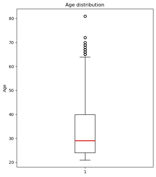
Age Distribution
Since regression might not be the right choice to model the relationship between age and blood pressure, I choose to use a hypothesis test. First, I visualize the age distribution with a box plot.
The thick line inside the box sits at about 29 years, telling me the median age.
The box itself spans roughly 24 to 40 years, which is the interquartile range, so half of the subjects fall in that 16‑year window.
The lower whisker drops down to around 21 years, and the upper whisker reaches about 64 years, marking the most extreme non‑outlier ages.
Above the upper whisker, there are several outlier points up near 65 to 82 years, showing a small tail of much older individuals.
Overall, the distribution is right‑skewed, with a longer tail toward higher ages, indicating that while most participants are clustered in their mid‑20s to late‑30s, a handful are significantly older.
Blood Pressure by Age Cohort
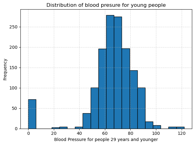
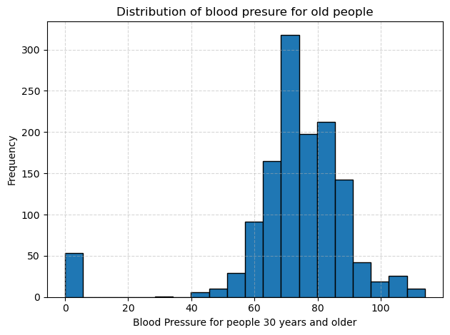
I split the diastolic blood pressure measurements into two cohorts: people aged 30 and older and people aged 29 and younger. Then I plotted separate histograms to compare their distributions. In each plot, the dotted gridlines help me read frequencies more easily, and the bar at zero reminds me that some entries were missing or recorded as zero.
In the group of people aged 30 and older, blood pressure values cluster between about 70 to 85 mm Hg. Frequencies rise steeply in that range and then taper off more gradually into the 90 to 110 region, creating a long tail of higher readings. The variability is relatively large, with some readings exceeding 100 mm Hg, indicating that older participants often have both higher average pressures and more extreme values.
In the group of people aged 29 and younger, the peak shifts downward, so most readings fall between about 65 to 75 mm Hg. There are far fewer values above 90 mm Hg, and the overall spread is tighter than in the older group. However, like the older group, there is still that cluster at zero, which I will treat as missing data in future analyses.
Comparing the two histograms makes the relationship between age and blood pressure clear. Younger participants tend to have lower and less variable blood pressure, while older participants show a higher average and a broader distribution. To confirm this difference statistically, I ran a one-tailed Welch’s t test, choosing Welch’s version because the two groups have unequal variances, and obtained a p value effectively equal to 0. This result indicates that older participants have significantly higher diastolic blood pressure than younger ones.
# Do people with diabetes have higher BMI than those who don't?
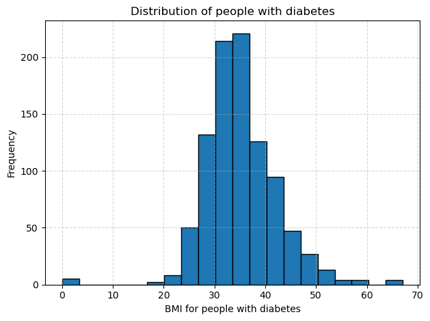
I began by splitting the data into two groups based on the diabetes outcome, and then plotted separate histograms of BMI for each group. The histogram for people with diabetes is centered around higher values and stretches further into the upper range, with most BMIs falling between about 30 and 40. The histogram for people without diabetes sits lower, with most BMIs between roughly 25 and 32 and a tighter overall spread. This visual shift to the right in the diabetes group suggests they tend to have higher BMI.
To confirm this difference, I computed the average BMI in each cohort and found it to be around 35 for the diabetes group versus about 30 for the non diabetes group. Because the two groups showed unequal variances, I ran a one-tailed Welch test and obtained a p-value effectively equal to zero. This result tells me that the higher BMI among people with diabetes is statistically significant.
Diabetes Prevalence by Age Group
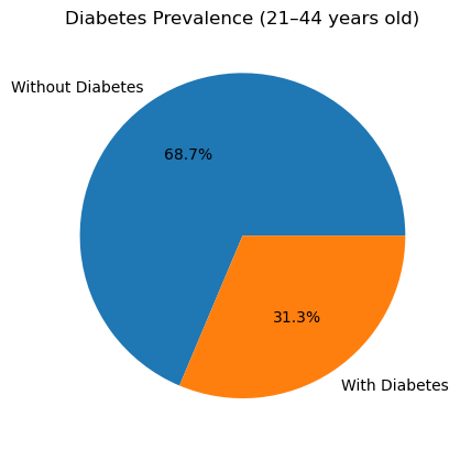
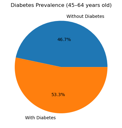
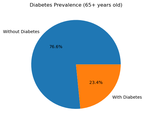
I calculated the diabetes rate in each age bracket by taking the mean of the binary Outcome (1 = diabetes, 0 = no diabetes) within each cohort. Here’s what I found:
In the 21-44 years group, 31.3 % of participants have diabetes.
In the 45-64 years group, 53.3 % of participants have diabetes.
In the 65 years and up group, 23.4 % of participants have diabetes.
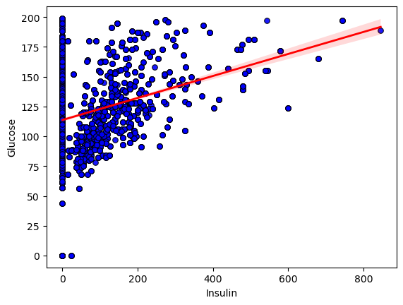
# What’s the relationship between Glucose and Insulin?
I began by exploring the relationship between insulin and glucose in the dataset. I created a scatter plot of each subject’s insulin level against their corresponding glucose reading, overlaying a regression line to highlight the overall trend.
To quantify how strongly these two measurements move together, I calculated Pearson’s correlation coefficient. The result was r = 0.323 with a two-tailed p value of 0, confirming that the upward tilt of the data points is highly unlikely to be due to chance.
Conclusion: The statistically significant positive correlation shows that, on average, higher insulin levels are associated with higher glucose concentrations. However, the moderate strength of the correlation (r ~ 0.32) and the wide scatter around the line indicate that additional factors also play important roles in determining glucose levels.
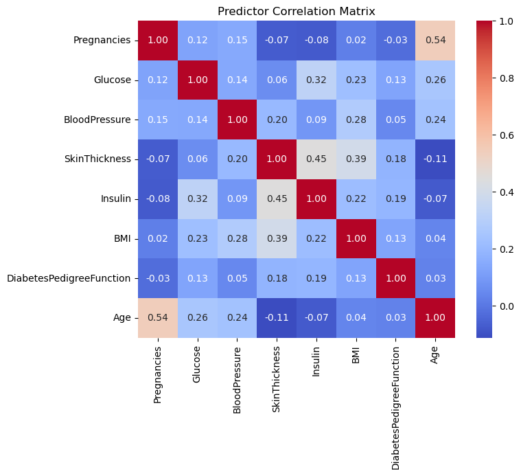
Correlation Matrix
I began by pulling together the eight predictors and computing their pairwise Pearson correlations to assess multicollinearity between the predictors.
The heatmap showed only low to moderate correlations (the strongest being around 0.54), so I kept all variables for modeling.
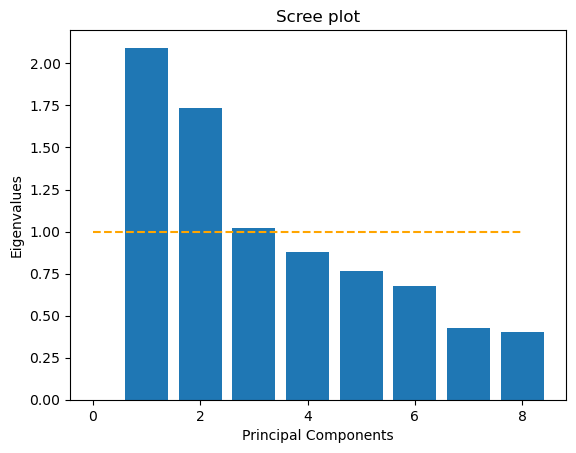
Principal Component Analysis (PCA)
Next, I standardized each predictor and ran a principal component analysis. The scree plot that displays eigenvalues for each component and includes a horizontal line at eigenvalue equals one indicates three components above that threshold. This is the Kaiser criterion.
However, when I computed the cumulative variance explained, I saw that I needed the first seven components to reach at least 90% of the total variance. Because my goal was to reduce the number of input dimensions while preserving most of the information, I decided to use those first seven principal components as my input variables. These components feed into my logistic regression model and preserve over 90% of the original variance using independent coordinates.
Next, I moved on to predictive modeling. I first split my full data matrix into a training set and a test set, holding out thirty percent of the records for evaluation. On the training set, I applied a standard scaling transform so that each clinical variable had zero mean and unit variance. Then I ran principal component analysis and retained seven components that together explained over ninety percent of the total variance.
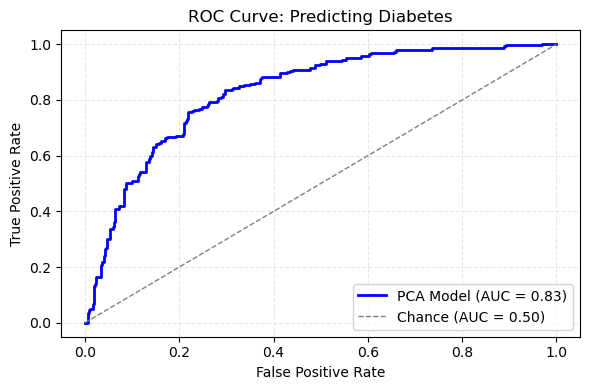
ROC Curve for Diabetes Prediction
With that reduced feature set in hand, I trained a logistic regression model using balanced class weights to account for the unequal numbers of diabetic and non‑diabetic cases. After fitting the model, I generated probability scores on the held‑out test set and used those scores to compute the receiver operating characteristic curve. The area under that curve was 0.84, which indicates strong discrimination between cases with and without diabetes.
The ROC curve itself rises steeply above the diagonal reference line, confirming that the model achieves high true positive rates at low false positive rates. In practical terms, this means I can flag a large fraction of true diabetes cases without generating excessive false alarms. The combination of dimensionality reduction via PCA and a regularized classifier thus delivers both efficiency and accuracy, and it sets the stage for comparing against a model built on the original eight predictors.